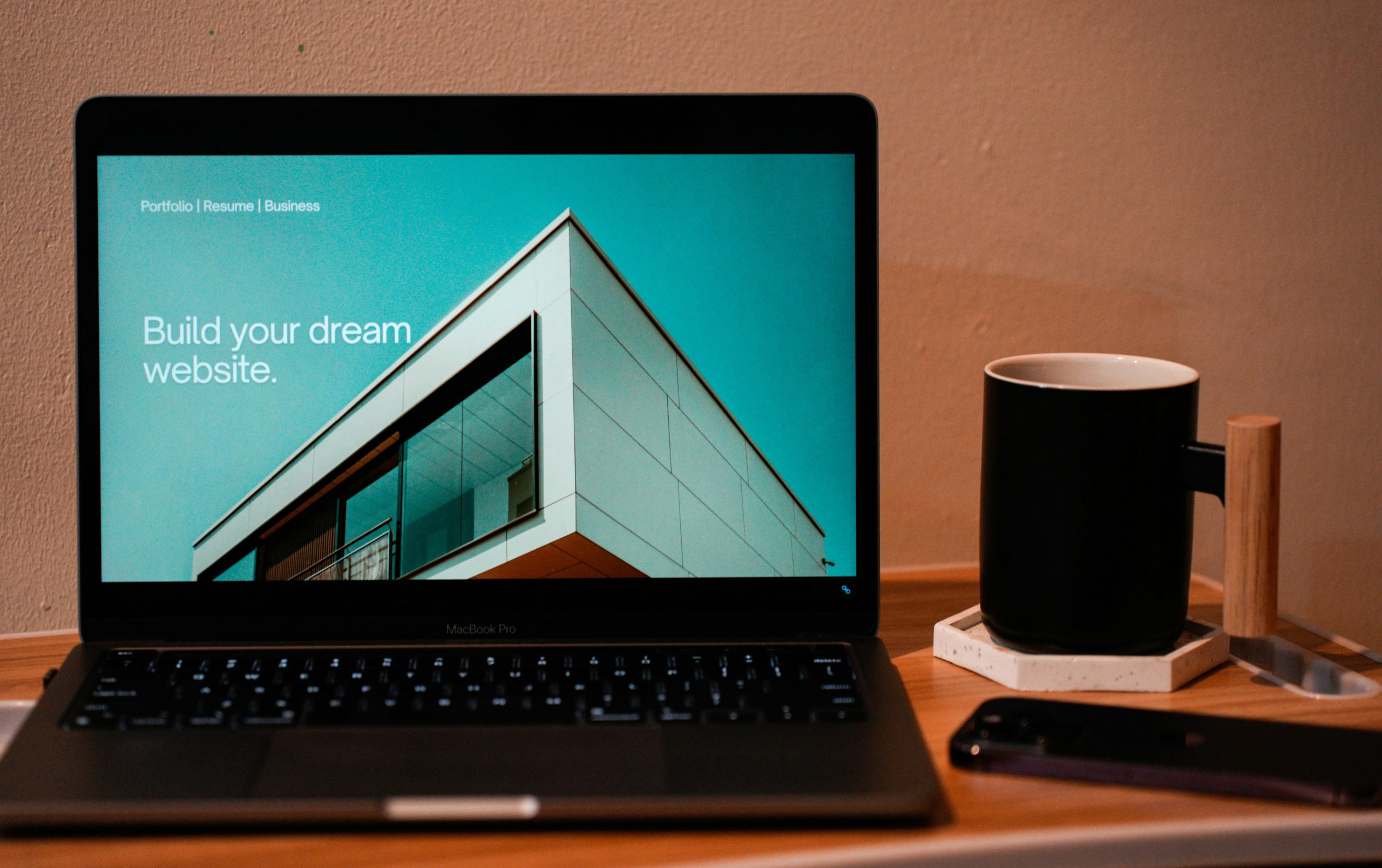
You don’t need to be a senior designer to build a beautiful website. Avoid these common beginner mistakes and give your WordPress site an instant facelift.
When you first start building a website in WordPress, it’s tempting to try every single button, font, and effect available. With powerful tools like Gutenberg and modern page builders, you have absolute freedom.
But here is the golden rule of web design: just because you can, doesn’t mean you should.
Most beginner websites don’t look amateur because they lack features—they look amateur because they have too many of them. If you want to elevate your design and keep it stress-free, adopt these 5 simple habits today:
Limit Your Typography to 2 Fonts
Using five different fonts on a single page creates visual chaos. Instead, pick one font for your headings (like Playfair Display or Inter) and one highly readable font for your body text (like Roboto or Open Sans). Keep your font sizes consistent across all pages.
Embrace White Space (Let It Breathe)
Don’t be afraid of empty space. White space (the breathing room between your text, images, and buttons) is a design element in itself. It guides the visitor’s eye and makes your content much easier to read. If your text blocks look too cramped, increase the padding.
Stick to a 3-Color Palette
Pick a dominant color (usually for your background/clean areas), a secondary color (for text and structural elements), and one striking accent color for your call-to-action buttons. A chaotic color scheme distracts users from your actual content.
Say No to Cheesy Stock Photos
Generic photos of people shaking hands in a boardroom scream “generic website.” Look for authentic, minimalist imagery on free sites like Unsplash or Pexels. Better yet, use high-quality abstract textures or original graphics that match your brand’s vibe.
Design for Mobile First
More than half of your audience will view your site on a phone. Always check how your columns, text sizes, and images scale down on smaller screens. If a complex layout looks messy on mobile, simplify it. Minimalism always wins on a smartphone.
Bottom line
Good web design is not about how much you can add; it’s about how much you can strip away while keeping the site functional. Keep it clean, keep it structured, and your WordPress site will instantly look like it was built by a pro.